DeletedUser
That is awesome! Looks to be a set of DT10 muzzles too (My competition gun!)
Thankyou")
Thankyou


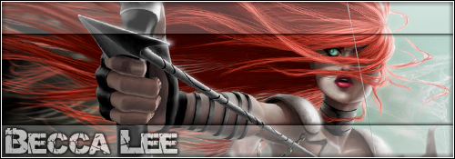
 You got the potential to become a great gfx designer!
I saw this picture and I had to try.I could use a new sig. Think I'll try you this time =)
Dimension: 90x700
File type: Couldn't care less
Primary text: Sauceysauce
Secondary text: I'm Just a Stain on the Bib of Humanity
Theme: Well, it has to do with sauce. I'm open to anything here. Anything will do really. Have fun with it.
Extras: I'd Like the main color to be red.

I saw this picture and I had to try.
:unsure: I changed the size to match the image, 90 tall wasn't enough. I also left the background as a transparency for the forum.
Let me know. :unsure:
I like that one! Not even close to what I expected but its awesome!
But, could I get the secondary text a little bigger? maybe the font a little easier to read. Also, can I get the primary text moved left just a little bit so it isn't covered by mustard guy? Wow, I ask too much =( Sorry

Don't wanna be rude but you haven't really improved . Same old style with pictures and text . They are funny but still .. why don't you try something new. You have potential but if you are going to stay at the same level for ever your sigs will get a boring look.
 ng, jpeg, jpg, or gif
Do you mind if I ask for a Town Profile? Might be a nice challenge for your mad skills.
Primary text: Rough Riders
Secondary text:NWO
Theme:I was thinking the classic bandit on a horse.
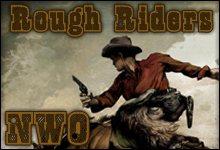
That was quick!
I like everything about it, especially the color tone. Your good!
Thanks for another wonderful piece of art.