some advice would be that it's probably the colour that's making it not look so great.
Here is what I'd do:
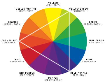
Take a look at this colour wheel. I'd say the majority of colour leans towards browny pink. Therefore on this chart I'd say it was between primary red and red purple (not perfect but this is the best chart I could find to fit on the forum).
There are a number of options you could choose from. You could go at right angle left from that colour. Orange. I believe this would look effective, but you'd have to be very careful of the shade. A light maroony orange would look fantastic. To make this colour pop you'd need to add an interesting shadow. An idea I had was to put lots of different colour (but still ccoordinating ofc) triangles behind and give them a slight (0.2?) gaussian blur + take the visibility down.
Another take on this would be to go directly opposite the two colours. Green. I'd explain more but I am at work.
What I'm basically trying to illustrate is that you don't need to rely on yourself solely when choosing font colour choices. I used to play about with colours a lot (I still do! I usually paint 10% transparent colours on top of a swatch until I am happy) until I started learning colour theory. It isn't the end of all choice but I believe it helps give a foundation.
Excuse the lack of hex codes - I'm at work without a graphics program. Haven't used one for a while!
I think ensuring your text is readable yet still stays in the background is an effective strategy and once mastered completes the piece you're doing; be it a signature or web design.
")